Due Today:
- P1 Process – 2 mood boards, 2 mind maps, 18 sketches (post only to Medium)
- Begin Blog 2 (due March 3rd)
For Today:
- Adobe XD Demo + Storyboards
- Discuss Prototyping + Personas
- Lecture: Float and Position + Layouts
- Storyboarding in Class
Float and Position
Class11_LayoutsFloatsPositionFloat Demo Files: http://web.cassreese.com/wp-content/uploads/2018/02/float_demo.zip
Float & Positioning Resources:
- CSS: Display Properties–A short review of display properties using markup.
- Float Example 1 | htmlandcssbook.com–A simple example of how floats work in practice.
- Float Example 2 | htmlandcssbook.com–More float applications.
- Floats | TryitEditor– Live practice with floating elements.
- Clearing Floats | htmlandcssbook.com–Demonstrates how to stop elements from wrapping around floats.
- Clearing | TryitEditor–Interactive clearing float exercise.
- Float Problem | htmlandcssbook.com–A common issue when using floats.
- Float Solution | htmlandcssbook.com–How to fix float-related layout issues.
- CSS Tricks – All About Floats!
- CSS Positioning Explained (MDN) – A clear and thorough guide covering
static,relative,absolute, andfixedpositioning with examples. - Relative Positioning | htmlandcssbook.com
- Absolute Positioning | htmlandcssbook.com
- Fixed Positioning | htmlandcssbook.com
- Positioning | TryitEditor
- Positioning | Tryit Editor2
- Z-index | TryitEditor
- Floats in Webflow (17m video, review as needed)— Review how these concepts can be applied in Weblow.
Layouts
Class12_LayoutTypes- Liquid, aka Fluid, Layouts: Fills the browser window. Note how content reflows when the browser window and columns resize.
- A Liquid Layout | htmlandcssbook.com
- Fixed-Width Layouts: Remains at the pixel width specified by the designer.
- A Fixed-Width Layout | htmlandcssbook.com
- Responsive Website Examples:
-
- Starbucks clear mobile vs desktop shifts, nav collapses visibly, product grid reflows
- CSS Zen Garden see the same HTML applied differently, many responsive themes
- Be Dance School clear mobile vs desktop shifts, nav collapses visibly, product grid reflows
- Forefathers Group what elements change or disappear in smaller viewports?
-
Personas
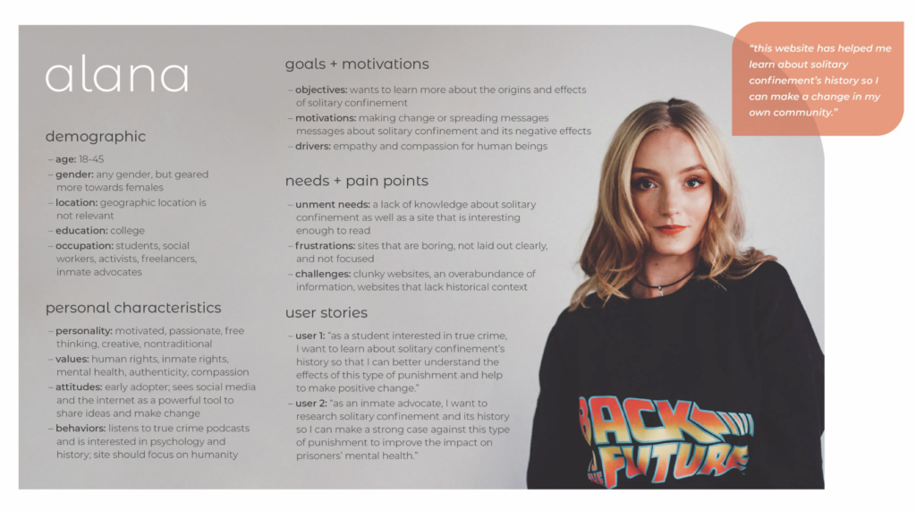
P1 Process – Personas: For persona, include the information below (including name and photo) and post to Medium. In UX design, a persona is a representation of a hypothetical user who is likely to use the product or service. Personas are created based on research and data about the target audience and are used to guide the design process by creating a shared understanding of the users and their needs. This persona will serve as a foundational tool to guide your UX design process.
Your persona will serve as a foundational tool in your UX design process. Include the following elements:
Basic Information
✔ Name: Give your persona a realistic name to humanize the profile.
✔ Photo: Include a representative photo or an avatar that reflects their demographic.
Demographic Information
✔ Age: Specify the age range.
✔ Gender: Identify the gender, if relevant.
✔ Location: Mention their geographic location (urban vs. rural, regional context).
✔ Education: Describe their level of education.
✔ Occupation: State their field of work and position.
Personal Characteristics
✔ Personality: Outline key traits (introverted, adventurous, analytical, etc.).
✔ Values: What matters most to them? (e.g., sustainability, convenience, affordability).
✔ Attitudes: Describe their general outlook (e.g., comfort with technology, openness to new ideas).
✔ Behavior Patterns: Any regular behaviors or habits that influence how they use your website?
Goals & Motivations
✔ Objectives: What is the user trying to achieve?
✔ Motivations: Why are these goals important to them?
✔ Drivers: What drives their behavior toward these goals?
Needs & Pain Points
✔ Unmet Needs: What gaps exist that your website could fulfill?
✔ Frustrations: What are their frustrations with current solutions?
✔ Challenges: List obstacles they face in achieving their goals.
User Scenarios / Stories
Choose one of the following approaches:
✅ Write 1-2 short scenarios describing how the persona interacts with your website.
✅ OR, write 1-3 user stories in this format:
As a [type of user], I want [some goal] so that [some reason].
Quotes & Testimonials
✅ Include 1-2 fabricated quotes that capture their thoughts and feelings about your website.
Persona Resources:
- Randomly Generated Identity—If you’d like, use this to generate a generic person to get you started.
- Random Avatar Generator—use a photo for your persona, or generate a random avatar.
Storyboarding → Prototyping
http://web.cassreese.com/wp-content/uploads/2026/02/storyboard.zip
This week we move through one continuous process: Storyboards/Wireframes → Prototypes. Think of your storyboard and early wireframe as the structural planning phase… where you organize content, establish hierarchy, and shape the reader’s journey for a one-page scrolling experience. You will first map this out visually (Illustrator is fine for layout thinking), then bring that structure into Adobe XD to build your working prototype. These are not separate exercises… they are connected steps in designing a clear, intentional user experience. Strong structure now will make your final site significantly more effective.
Storyboard/Wireframe focus (Illustrator): content flow, hierarchy, pacing
Prototype focus (Adobe XD): interaction, transitions, user testing
Create your prototype in Adobe XD (minimum 6 sections) with interactive hotspots linking to different parts of the page.
Once your prototype is complete:
✅ Click Share in the top-right corner of Adobe XD.
✅ Select Publish Prototype and set it to Anyone with the link can view.
✅ Copy the public share link.
✅ Paste the link into your Medium post and D2L “P1: Prototyping” Discussion Board for User Testing.
Prototyping Resources:
- Prototyping in Adobe XD
- Scrollable Artboards in Adobe XD
- Prototyping Alternate: Marvel App
- Prototyping Alternate: Proto.io
Project 1 Timeline:
tr 2.26 week 6 1 persona + storyboard + lo-fi mobile prototype for User Testing + identity sketches
t 3.3 week 6 2 style tiles
tr 3.5 week 7 mobile/tablet/desktop mockups (3 mockups total + must include logo) using selected style tile for homepage
t 3.17 week 7 revised mobile/tablet/desktop mockups + dev plan (wireframes)
tr3.31Final Project Due Date
Due Next Class
- P1 Process Work Due:
- storyboard
- 1 mobile/desktop lo-fi prototype for User Testing with a minimum of 6 section (header, footer, and 4+ additional sections) + identity sketches
- 1 persona
- This week: Read Chapter 15 in Duckett’s HTML & CSS. (Be sure you are caught up on Ch 1, 2, 3, 4, 5, 10, 11, 12, 13, 18, pp.183–188 + pp. 407–416 + pp.431–440)
Due 3.3 – Blog 2: Selecting and Analyzing Your Website’s Content – post to D2L (or Medium “Blog 2” Story + then post to D2L) + 2 Style Tiles