Due Today:
- Blog 3: P1 Development Plan – Referencing your final mockup, draw boxes around your HTML containers & label them.
- Mockup Refinements (post to new slide following your original mockups: Project1 – S26 Critique.pptx )
- Begin project set up in Webflow – Review Our Cloning Policy
For Today: Warmup 5 + Responsive Design; Refinement Mockup Digital Crit
For “paper” critique: leave 5 peer reviews on revisions or new designs (online section / they are all cross-posting comments on your work) Project1 – S26 Critique.pptx
This week we will begin developing in Webflow. Web designers rarely build every part of a website from scratch. In professional practice, designers often reuse or clone components such as navigation bars, grids, galleries, or layout structures to speed up development. This semester, you are allowed to do the same in Webflow, with clear guidelines. Before developing, fully review Our Cloning Policy
Responsive Design
Responsive_WebDesign
(only go to slide 21 in above PDF)
2. Responsive Resources:
- Responsive Web Design Demo | w3schools
- Interactive Installations | These installations RESPOND in real-time to human movement, gestures, or presence using sensors, cameras, or AI
- Viewport Sizes
- PxtoEm Conversion
- font-size in ems | Tryit Editor
- min-width and max-width | HTML & CSS Book
- max-width | Tryit Editor
- Responsive images = Images that scale with their container instead of having fixed widths.
- max-width: 100%; images
- object-fit | Tryit Editor
Excellent visual example showing how images can scale and crop within containers. - object-cover | Tryit Editor
- object-fit | excellent visual example!
- Barebones CSS for Fluid Images
- Responsive Image Guide
Clear guide explaining how images scale and adapt across devices. - Responsive Image Guide 2
- Responsive Background image | Tryit Editor
- Breakpoints:
- media queries | Tryit Editor
- 🖥 Webflow Breakpoints Overview | Learn Webflow’s built-in breakpoints for desktop, tablet, and mobile.
- Responsive Website Examples:
- Responsive Web Design Inspiration | AWWWards
- Responsive Website Example
- CSS Conf.EU
- French Paper
- Web Typography:
- Fontjoy
- Typ.io | Shows examples of typography in live websites
- Fontpair.co | pairing Google Fonts
- Typescale
Project 1 Timeline:
t 3.17 week 7 revised mobile/tablet/desktop mockups + dev plan (wireframes)
tr3.31Final Project Due Date
CSS Links + Navigation
Most website navigation is built from a list of links using <nav>, <ul>, and <li>. Tools like Webflow generate this structure automatically, but understanding it helps you debug layouts and build accessible websites.
Links + Nav Resources:
Note: Review these concepts as needed—mostly for building different navs or modifying unordered lists.
- Vertical navigation | Tryit Editor – nav developed inside ul
- Different Ways to Build Navs #1
- Different Ways to Build Navs #2 – shows how one simple <ul> can become many navigation styles using CSS.
- Intro to different kind of Navigations in Webflow (best starting point)
- Webflow Navbar Basics
Vid#3 above walks you through these concepts, but watch if you need more help. Clear explanation of the built-in Navbar component, including logos, nav menu, nav links, menu button for mobile - Homepage Navigation – Webflow University
Vid#3 above walks you through these concepts, but watch if you need more help. A short, clear walkthrough of adding a navbar, styling links, turning nav into - Need a “dot nav in Webflow”? In Webflow, search for “Fixed Dot Navigation” site and go to the static page “dots”. From there, you can copy/paste the “right dots container” from the nav bar into your file. It will take some work to set up the links to the sections, but should get you up and running!
Warmup 5 – Webflow Recipe
In this warmup, you’ll build your recipe webpage—-using the same content from our past recipes--in Webflow while learning about QuickStack for layout, HTML5 sections, navigation/link styling, image handling, and typography.
_________________________________________________________________
Step One:Project Setup
- Create a new project in Webflow and name it "First Last Warmup 5".
- Enter the Webflow Designer and begin with your blank page.
Step Two: Add the Page Structure
1. Click the Add Panel (+ icon) in Webflow.
2. Drag a Section onto the canvas.
3. Apply a class name to the section:
- Click the section and rename it "Header" in the Navigator panel.
- With the section selected, go to the Style Panel (right sidebar). In the Selector field, type "Header" and press Enter to create the class.
4. Change the HTML tag:
- With the section still selected, go to the Settings Panel (⚙️ tab).
- Under Tag, select "Header" from the dropdown.
5. Repeat these steps for the next two sections:
- Main Section (class: "Main", tag: <main>)
- Footer Section (class: "Footer", tag: <footer>)
_________________________________________________________________
Step Three: Add Containers
1. Inside each section, add a Container:
- Drag a Container into the Header section.
- Drag a Container into the Main section.
- Drag a Container into the Footer section.
2. Set max-width for all three containers:
- Select a container, go to the Style panel, and set:
- Max-width: 800px
- Margin: Auto (centers it)
- Apply this to all three containers.
✅ Checkpoint: Each section should now contain a centered container.
_________________________________________________________________
Step Four: Add the Recipe Content + Layout with QuickStack
1. Use Webflow's QuickStack to structure the page layout:
- Click the Add Panel (+).
- Drag a QuickStack into the container of the Main Section.
- Inside the QuickStack, add (copy/paste over your recipe content):
- An <h1> with the recipe name (e.g., "Best Pancakes Ever").
- An <h2> for "Ingredients", and below it:
- An unordered list (<ul>) with <li> items for ingredients.
- An <h2> for "Instructions", and below it:
- An ordered list (<ol>) with <li> items for steps.
2. Adjust the QuickStack settings for responsiveness:
- Select the QuickStack, go to the Style Panel, and check:
- Gap: Add spacing between elements for better readability.
- Flex settings: Ensure elements align properly across breakpoints.
- Margin & Padding: Adjust spacing inside and outside the QuickStack.
3. In the footer container, add a link to the original recipe source.
✅ Checkpoint: Your page now has organized recipe content.
_________________________________________________________________
Step Five: Create Navigation and Jump Links
1. Add Navigation Links:
- Select the Nav Bar element.
- Click Add (+) and insert into the container in header.
- Modify nav items to two Text Links.
- Rename them: "Ingredients" and "Instructions"
2. Set Up Jump Links:
- Click on each Text Link, go to the Settings Panel (⚙️).
- Under Link Settings, choose Page Section and enter:
- "Ingredients" → #ingredients
- "Instructions" → #instructions
3. Add IDs to Headers:
- Scroll down to your Main Section where your recipe content is.
- Click on the "Ingredients" heading (<h2>), go to Settings (⚙️), and set its ID to "ingredients".
- Click on the "Instructions" heading (<h2>), go to Settings (⚙️), and set its ID to "instructions".
✅ Checkpoint: Now, clicking the navigation links should smoothly scroll to the corresponding sections.
_________________________________________________________________
Step 6: Insert and Style an Image
1. Drag an Image block into the Main Section above the Ingredients list.
2. Upload an image related to your recipe.
3. Make the image responsive:
- Select the image, go to Style Panel, and set:
- Max-width: 100% (so it scales properly / automatically applies).
- Height: Auto (to maintain proportions).
- In the Assets panel, add a descriptive alt text for accessibility.
4. Optional:
Try setting Object-fit: cover; to crop and fit the image.
✅ Checkpoint: Your page displays a properly sized image with alt text.
_________________________________________________________________
Step 7: Typography Adjustments
1. Add a Webfont:
- Go to the Project Settings → Fonts tab.
- Select a Google Font or Adobe Font and add it.
- Apply this font to:
- Body (default font for the site).
- Headings (h1, h2).
- Paragraphs (p).
- Links (a).
2. Adjust text sizes:
- Set body font size to 16px (100%).
- Set headings (h1, h2) to larger sizes (1.5em, 2em).
- Set paragraph, lists, blockquotes, links).
- Ensure good line spacing so text is readable.
✅ Checkpoint: Your text should be visually appealing and readable.
_________________________________________________________________
Step 8: Apply a Color Scheme & Accessibility Check
1. Set a Background Color:
- Select the Body tag and choose a light background color.
2. Update Text Colors:
- Make sure text contrasts well with the background.
3. Check Accessibility:
- In Webflow, run the color contrast checker (watch: 1m video on color accessibility in Webflow).
- Ensure all text is legible and accessible.
4. Adjust widths, margins, to consider the measure (line length). Make sure the text doesn't touch the edge of the browser, and that all of the content is always centered.
5. Stylize the links with hovers.
✅ Checkpoint: Your color scheme should enhance readability.
_________________________________________________________________
Step 9: Make It Responsive
1. Switch to Tablet View in Webflow.
- Adjust spacing & text sizes for readability.
- Check if the layout works properly.
2. Switch to Mobile View:
- Adjust spacing & text sizes.
- Convert the recipe layout from multi-column → single-column.
- Ensure the navbar stacks vertically if necessary.
✅ Checkpoint: Your design should look great on all devices.
_________________________________________________________________
Step 10: Publish & Submit
1. Publish your Webflow project.
2. Upload the link to the "warmup5" folder via D2L.
✅ Checkpoint: Your final project is submitted and ready for grading.
_________________________________________________________________
| Criteria | Points |
|---|---|
| Webflow project named correctly | 0.25 |
| QuickStack used for layout and responsive design | 0.75 |
| Three sections: Header, Main, Footer | 0.25 |
| Each section has a container with max-width | 0.25 |
| Recipe content includes proper HTML elements | 0.25 |
| Responsive image with max-width 100% and alt text | 0.25 |
| Typography adjusted (web font, sizes, spacing, hovers) | 0.50 |
| Navigation links styled and jump links work | 0.50 |
| Footer recipe source link added and styled | 0.25 |
| Color scheme applied, accessibility checked | 0.25 |
| Project exported and uploaded via FTP | 0.25 |
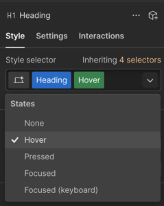
Hovers: To style hovers in Webflow, select the arrow to the right of your selector and select “Hover.” The green hover tag will appear in the Style Selector box. Any CSS you apply when the hover is selected will apply to hovers.
Webflow Resources:
Due by end of next Class (1:45PM)
- Progress on P1 Development
- Blog 4 – 2 Comments
Due @start of class Tuesday 3.24
- Warmup 5 + watch videos step 6 + beyond