📌 Weekly Structure (applies every week)
- Content Release: Mondays @ 11 AM(Tues @ 11 AM if holiday week).
- Deadlines: All assignments due Mon @ noon (or Tue when no Monday class)
- ZOOM : Optional. Monday review + critique (recorded). If no Monday class → prerecorded review + Wed @ noon live session.
- Critiques:
- Regular weeks: Mon @ noon → Wed @ noon
- No Monday class: Tue @ noon → Thu @ noon
- Use discussion board if not in ZOOM
- Remote Office Hours: Wednesdays, 11AM–1PM → Schedule Here
Week 7 Links & Notes
Live Sessions This Week:
👉 Join Live: Mon 3.2 @ noon(week 7 review)→ 🎥 [Join Here]
Will be recorded for those unable to attend live.
🎥 Watch: Mon 3.2 Weekly Review Recording → [Watch Here]
Week 8 is Spring Break (no class)
Looking Ahead (Week 9)
Next live (recorded) session: Mon Mar 16th@ noon
This week’s deadlines
Monday, Mar 16th @ noon
- P1 Mockups: One set of responsive mockups (3 sizes – desktop/tablet/mobile) using one theme from style tiles. widths: 1920px / 768px / 375px – Create in Illustrator, Photoshop, or Adobe XD. Use pixels as unit of measurement. Post to your previous “Project 1” Story on Medium created for this project and Project1 – S26 Critique.pptx
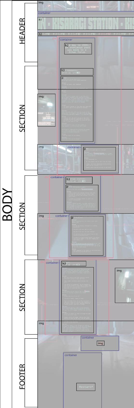
- Blog 3: P1 Development Plan – Referencing your final mockup, draw boxes around your HTML containers & label them.
Due Wednesday 3.4 @midnight:
- User Testing Feedback on D2L for 3-5 users > D2L > P1 Prototypes – User Testing (post prototypes as early as possible, preferably on Monday, in week 7)
Due Wednesday 3.18 @midnight:
- Blog 3 – 2 peer comments
- P1 Critique Peer Comments Due – 5 Comprehensive Peer Reviews on Mockups
Last week, we completed personas, prototypes, and style tiles
Next week, we will move on to P1 development in Webflow and Warmup5
Enjoy Spring Break! 🙂
Weekly Content
Week 7 (All items need to be complete by end of week):
SECTION I – CSS Grid
- Discuss CSS Grid in Webflow (videos – approx 24m)
SECTION II – Project 1 + Blog 4 - Continue Project 1: Typographic Storytelling
- Due Wed 3.4@midnight. Prototype User Testing
- Due Mon 16th. P1 Mockups – Mockups: 1 set of Mockups (phone, tablet, desktop) including logo and posted to “Project 1” story on Medium AND Project1 – S26 Critique.pptx
- Mon 16th–Wed 18th. P1 Critique: Project1 – S26 Critique.pptx
- Due Mon 16th. Blog 3: Project 1 Development Plan
- Review development resources, as needed
SECTION III – Webflow Intro - Introduction to Webflow (videos – 23m15s )
SECTION I – Web Concepts
1. CSS Grid to Quickstack
Although we will primarily build using QuickStack in Webflow, QuickStack is built on CSS Grid principles. Understanding Grid helps you think in rows, columns, alignment, and responsive structure… which is exactly how QuickStack works behind the scenes. The videos below explain the foundational grid logic that will make your QuickStack layouts stronger and more intentional. You are not expected to hand-code Grid for this project.
You are learning the structural thinking behind the tool. If you are short on time, prioritize Video 3 and the Webflow Quick Stack video below. Videos 1-2 strengthen conceptual understanding.
CSS Grid Resources (Reference as needed for more advanced ideas, but everything needed is included in the demo/lecture files above):
- Review as Needed:
- CSS Grid – Justification, Alignment & Responsive Layouts – Alligator.io
- CSS Grid Tricks & Ordering – CSS-Tricks
- Optional Flexbox Guides – display: flex; Guide: Flex Cheatsheet / Flexbox Guide: Understanding Flexbox PDF
SECTION II – assignments
2. Project 1: Typographic Storytelling
3. User Testing / Adobe XD Prototypes / D2L
4pts for Prototype and User Testing
This week’s user testing focuses on how the story unfolds as someone scrolls. We are looking at information architecture, narrative pacing, scroll psychology, clarity of navigation. Keep in mind this is simulated, not real user data. AI is not the authority. Compare AI feedback with real-person feedback. AI may make assumptions. You should validate or reject feedback with justification. If you disagree with it, defend your design decisions. Keep in mind: If the structure is weak at low fidelity it will not be fixed with typography later.
Part 1 on D2L: User test with 3-5 peers (minimum of 3). Look for patterns (not one-time opinions).
Answer the following:
- Navigation & Flow: Is the navigation intuitive? Does the story unfold logically? Are any section transitions confusing?
- Story Clarity & Engagement: Is the tone clear even without final styling? Where does attention drop? What sections feel strongest or weakest?
- Interactivity & Usability: Are clickable areas obvious? Does the page feel easy to move through?
- Visual Layout & Structure: Does the section breakdown support the narrative?
Should any sections be combined or split? Is there a better order for the content?
- Part 2 (Optional): AI-Assisted Simulated User Testing
As part of this assignment, you are invited (not required) to experiment with AI-assisted simulated user testing.
The goal is to explore how AI responds to your persona and structure, and to compare that feedback with human user testing. This is framed as a research experiment… not as a requirement or endorsement.
If you prefer not to use AI for ethical or personal reasons, you may skip this portion and instead provide additional human testing analysis. You will not be penalized. Our goal is to explore emerging tools critically, not blind use.
To proceed, open (free) ChatGPT.
Paste: - Your persona’s content (reference prompts below)
- A clear, concise outline of your prototype structure (nav labels, section titles, 1-2 sentences per section).
Your Content:
User Persona: [Paste persona]

Site Structure (add more sections as needed):
Nav items:
1. Home
2. Beginning
3. Conflict
4. Turning Point
5. Resolution
6. Reflection

Section Breakdown:
Section 1: Header introducing the story + short intro paragraph.
Section 2: Background context.
Section 3: Main narrative rising tension.
Section 4: Turning point moment.
Section 5: Outcome.
Section 6: Closing reflection + citation.

Goal:
Create an emotional storytelling experience that feels [insert keywords] and [insert keywords].
Prompt #1:
You are roleplaying as the following persona:

[PASTE PERSONA - reference above]

Read the site structure carefully.

Do not comment on typography, color, or styling.
Focus only on content flow, clarity, pacing, and navigation structure.

1. What do you notice first?
2. Does the section order feel logical?
3. Where might you lose interest?
4. Is anything confusing or redundant?
5. What structural change would improve the experience?

Respond in first person as the persona.
Then, run a second prompt:
Now step out of the persona.

Act as a UX designer reviewing this low-fidelity prototype.

Identify:
– Structural weaknesses
– Navigation issues
– Sections that need clearer purpose
– Opportunities to combine or divide content
- Whether the structure supports the stated emotional goal

Keep feedback specific and actionable.
Part 3: On your Medium, Identify patterns from both human + AI feedback.
- Were there similarities?
- Were there differences?
- Did AI share anything your peers did not?
Write:
- 3 specific structural action items (revisions you will implement).
- Defend 1 structural decision you are choosing not to change.
4. P1 Process – Mockups: 2 DIFFERENT Mockups
4pts for Mockups
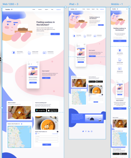
Design of initial and refined homepage mockups. Using one visual direction from your style tiles, design and post to “Project 1” story on your Medium AND P1 Collaborative PPT Critique (link above).
Using your user testing feedback, create 3 sizes (desktop -1260px+, tablet -768px, phone-320px), using ONE of your style tiles +user testing feedback + sketch designs. This is a homepage design and should include the header (logo and tagline), potential content leads into the site and clear use of a footer. Refer to this article to inform different types of content that can exist on a homepage. Consider the content that will go on the homepage before starting to design. Post to Medium and Collaborative PPT Critique.
5. P1 Critique: Project1 – S26 Critique.pptx
Considerations for Critique:
- Initial Reactions: What is your first impression of the design? What is the total overall effect? Does it feel right?
- Content: Is everything present that should be included in the design?
- Layout: Does everything seem to be in the right place?
- Typography: Tone? Readability? Is the content on the page “easy on the eyes”? Unity with Theme? Links?
- Color: Do the colors work well together and feel appropriate for the overall mood?
- Images: consistent styling? proportion?
- Is there a clear visual hierarchy for the content? Is the viewer able to scan the page quickly to find what they are looking for?
- Is there a clearly defined footer?
- How intuitive is the design to navigate?
- Completeness: Is anything missing? Conversely, is anything there that shouldn’t be?
A. Content Completeness + Layout - Is everything present in the design and intuitively feel in the right place? Placements, grid, columns, measures.
B. Typography - Typeface Combination? Tone? Readability? Is the content on the page “easy on the eyes”? Unity with Theme? Links?
C. Color - Do the colors work well together and feel appropriate for the overall mood? Palette success. Eye movement. Link colors.
D. Images - connection with theme? success? consistent styling? proportion and scale?
E. Footer success - clearly defined? suggestions to improve.
F. Header success - clear identity; eye-catching visuals; suggestions to improve.
Project 1 Timeline:
m3.2 week 7 2 style tiles + 1 persona + storyboard + lo-fi mobile prototype for User Testing
m3.16 week 8 mobile/tablet/desktop mockups (3 mockups total + must include logo) using selected style tile for homepage + development plan + wireframes
w3.18 peer critique feedback due @ noon on d2l “project 1 – mockups” discussion board + begin development
m3.23week 9 revised homepage mockup designs + continue development
m4.6week 10Final Project Due Date
6. Blog #3: Preparing for Development in Webflow
10pts > Post to D2L > Blog 3
Blog 3 is your development blueprint. This post bridges your design and your build. You will translate your visual layout into a structural plan that could realistically be built in Webflow. We are thinking like developers.
- Introduction (1 Points): Briefly introduce (1) your project theme, (2) your storytelling goal, (3), the intended user experience, and (4) the emotional tone you are aiming to create. Keep this concise (1-2 short paragraphs).
- Structural Layout Mapping (5 Points) This will serve as a visual development map.
Desktop-Only Screenshot + Structural Overlay: Upload one annotated screenshot of your desktop prototype. On top of the image, clearly label:
A. Page Structure:body,nav,header,footer,sections(minimum of 6 sections) Keep in mind:
body: The overall container for your website.
header/footer: Top and bottom sections that likely contain your navigation and copyright information.
sections: Major content areas within your body, potentially corresponding to Webflow sections.
containers: For managing content width, corresponding to Webflow’s container element (live inside sections).
divs: Used for grouping content or layout purposes, translating to div blocks in Webflow.
B. Layout System Inside Each Section: Show how each section is built using: Section → Container → QuickStack → Columns → Nested elements (h1, h2, ul, p, div, etc). Indicate (1) the number of columns and (2) full-width vs. constrained containers and (3) whether columns are equal (50/50) or uneven (70/30). This is grid logic, considering how content is divided horizontally.
C. Breakpoint Notes: Below the image, include a short bullet list explaining how layout shifts at tablet and mobile. What stacks? What changes column count? Does navigation shift? Keep this tight and specific. - Development Strategy (3 Points) In one short paragraph, explain: (1) How you will construct your layout using QuickStack, (2) Where nesting may be required, (3) How will you manage spacing (margin vs padding), and (4) Any anticipated layout challenges. Focus on the structure, not the visual styling.
- Peer Engagement and Feedback (1 Point) Comment on 2 peer’s Blog posts. Offer concrete suggestions on: Is their structural labeling clear? Do their rows/columns make sense? Are their breakpoint transitions realistic? Is their Webflow strategy feasible? Share any HTML/CSS tips or resources that could benefit their project.
Share the blog on D2L Discussion > Blog 3
Example: (this example is missing breakpoint notes and clear nesting, due to different requirements, but can be used as a visual reference to get you started).
7. Development Resources (optional, as needed):
- Create a Seamless Background Image in Photoshop
- Box Sizing Property
- CSS Centering Guide
- CSS Centering Guide 2
- Full Page Background Image
- Transparency that doesn’t affect children
- CSS3 Generator
- Parallax Scrolling
SECTION III – technical
8. Intro to Webflow
Download to this handout to take notes or refer to while using. We will do an introductory demo together in class. As needed, I would also like for you to watch additional Webflow Training here training videos Getting Started, Web Structure, and Element Basics.