Due Today: 2 Style Tiles + Blog 2
For Today:
- Introduction to Webflow
- Small Groups to discuss style tile directions
- Studio for P1 Mockups (limited due to user testing)
Blog #3: Preparing for Development in Webflow
10pts > Post to D2L > Blog 3
Blog 3 is your development blueprint. This post bridges your design and your build. You will translate your visual layout into a structural plan that could realistically be built in Webflow. We are thinking like developers.
- Introduction (1 Points): Briefly introduce (1) your project theme, (2) your storytelling goal, (3), the intended user experience, and (4) the emotional tone you are aiming to create. Keep this concise (1-2 short paragraphs).
- Structural Layout Mapping (5 Points) This will serve as a visual development map.
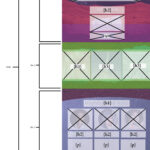
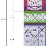
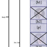
Desktop Only – Screenshot + Structural Overlay: Upload one annotated screenshot of your desktop prototype. On top of the image, clearly label:
A. Page Structure:body,nav,header,footer,sections(minimum of 6 sections) Keep in mind:
body: The overall container for your website.
header/footer: Top and bottom sections that likely contain your navigation and copyright information.
sections: Major content areas within your body, potentially corresponding to Webflow sections.
containers: For managing content width, corresponding to Webflow’s container element (live inside sections).
divs: Used for grouping content or layout purposes, translating to div blocks in Webflow.
B. Layout System Inside Each Section: Show how each section is built using: Section → Container → QuickStack → Columns → Nested elements (h1, h2, ul, p, div, etc). Indicate (1) the number of columns and (2) full-width vs. constrained containers and (3) whether columns are equal (50/50) or uneven (70/30). This is grid logic, considering how content is divided horizontally.
C. Breakpoint Notes: Below the image, include a short bullet list explaining how layout shifts at tablet and mobile. What stacks? What changes column count? Does navigation shift? Keep this tight and specific. - Development Strategy (3 Points) In one short paragraph, explain: (1) How you will construct your layout using QuickStack, (2) Where nesting may be required, (3) How will you manage spacing (margin vs padding), and (4) Any anticipated layout challenges. Focus on the structure, not the visual styling.
- Peer Engagement and Feedback (1 Point) Comment on 2 peer’s Blog posts. Offer concrete suggestions on: Is their structural labeling clear? Do their rows/columns make sense? Are their breakpoint transitions realistic? Is their Webflow strategy feasible? Share any HTML/CSS tips or resources that could benefit their project.
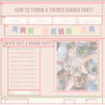
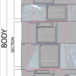
Share the blog on D2L Discussion > Blog 3Example: (this example is missing breakpoint notes and clear nesting, due to different requirements, but can be used as a visual reference to get you started).
Intro to Webflow
Download to this handout to take notes or refer to while using. We will do an introductory demo together in class. I would also like for you to watch additional Webflow Training here training videos Getting Started, Web Structure, and Element Basics.
webflow
P1 Process – Mockups:
Mockups: 1 set of Mockups using two potential themes posted to “Project 1” story on your Medium AND Project1 – S26 Critique.pptx
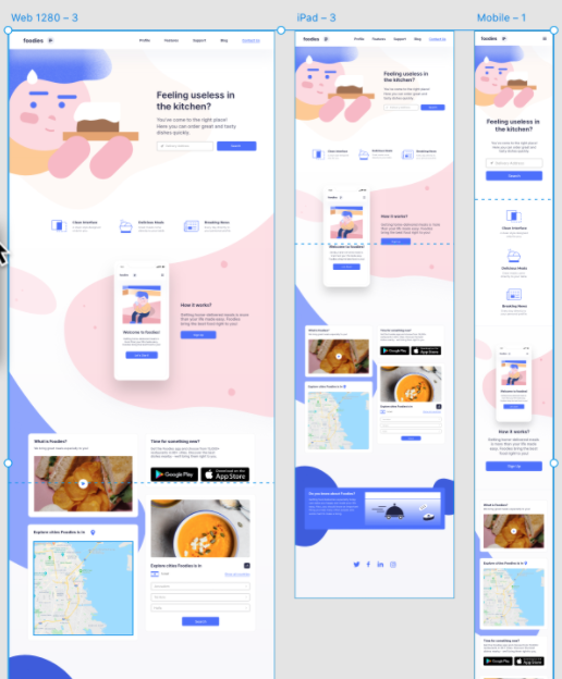
Using your user testing feedback, create 3 sizes (desktop -1260px+, tablet -768px, mobile-375px), using ONE of your style tiles +user testing feedback + sketch designs. This is a homepage design and should include the header (logo and tagline), potential content leads into the site and clear use of a footer. Refer to this article to inform different types of content that can exist on a homepage. Consider the content that will go on the homepage before starting to design. Post to Medium and Collaborative PPT Critique.
Due Thursday 3.5
- For Rough Critique: Begin Responsive Mockups (3 size widths: 1920px / 768px / 375px) – Create in Photoshop, Illustrator, or Adobe XD. Use pixels as unit measurement. Upload to your P1 Medium Story + Project1 – S26 Critique.pptx
Due After Spring Break 3.17:
- Blog 4: P1 Development Plan – Referencing your final mockup, draw boxes around your HTML containers & label them.
- Mockup Refinements (post to new slide following your original mockups)
- Begin project set up in Webflow
Enjoy Spring Break! 🙂