📌 Weekly Structure (applies every week)
- Final Exam Schedule for PennWest
- Content Release: Mondays @ 11 AM(Tues @ 11 AM if holiday week).
- Deadlines: All assignments due Mon @ noon (or Tue when no Monday class)
- ZOOM : Optional. Monday review + critique (recorded). If no Monday class → prerecorded review + Wed @ noon live session.
- Critiques:
- Regular weeks: Mon @ noon → Wed @ noon
- No Monday class: Tue @ noon → Thu @ noon
- Use discussion board if not in ZOOM
- Remote Office Hours: Wednesdays, 11AM–1PM → Schedule Here
Week 14 Links & Notes
Live Sessions This Week:
👉 Join Live: Mon 4.20 @ noon(week 14 review)→ 🎥 [Join Here]
Will be recorded for those unable to attend live.
🎥 Watch: Mon 4.20 Weekly Review Recording → [Watch Here]
Looking Ahead (Week 15) – last week of classes before finals
Next live (recorded) session: Mon Apr 27th @ noon
Finals week (last) live session: Mon May 4th @ noon
Final Exam Schedule for PennWest
This Week’s deadlines
Monday, Apr 27th @ noon
- Blog 4: P2 Development Plans – Post to D2L Discussion Board “Blog 4”
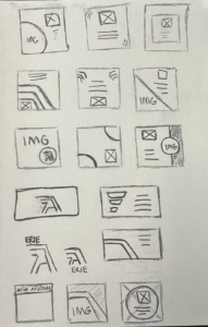
- P2: Social Media Kit – 15 sketches to your Medium
- Warmup 6 published link to “Warmup 6” on D2L Assignments Folder
- P2 Progress on Development –just get started! 🙂
For THIS Wednesday: - P2 3 Peer Critiques to Homepage Mockups + Post your revisions to (critique guidelines on slide 1 of file) S26_Project2_DesignProces
Last week, we finished our P2 prototypes and style tiles
Next week, we will work on P2 development before final submission in Week 16.
Late work reminder:
– Final submission cutoff: No work will be accepted after Fri, May 1 @ 11:59 PM (next Friday).
– Any late assignment submitted on May 2nd or later will receive an automatic zero (0).
Weekly Content
Week 14 (All items need to be complete by Monday @9am)
SECTION I – Interaction, Domains & Hosting and Forms
- Discuss Interactions + Warmup 6 (videos – 44m13s)
note: If you started the vids from last week, please watch here - Review Interactions Resources
- Watch Forms, Domains, and Hosting Lecture (videos – 64m42s)
- Practice Forms on Webflow (no assignment attached to this)
- Review Hosting Resources
SECTION II – Project 2
- Complete Design & Begin Development P2: Event Website
- Due Wed. 4.22 3 Peer Critiques to Homepage Mockups + Post your revisions to (critique guidelines on slide 1 of file) S26_Project2_DesignProces
- Due Mon. 4.27 Blog 4: P2 Wireframe and Development Plan to D2L Discussion Board “Blog 4”.
- Review P2 Points to Consider
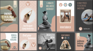
- Review Social Media Kit Guidance
- Due Mon. 4.27 Social Media Kit 15 sketches
- Due Mon. 4.27 Warmup 6 – to D2L Assignments
- Due Wed. 4.29 (looking ahead) Social Media Kit 10–15 digital concepts P2 Story on Medium.
SECTION I – Web Concepts
1. Interactions
This week, we will continue with learning Interactions in Webflow and move into warmup 6. Follow along with Warmup 6 (#12 below) for directions.
if you already began the warmup last week and want to continue in the old interface, please watch here.
2. Interactions Resources
3. Forms, Domains, and Hosting
Demo: Forms + button hover animations (transitions, hovers, CSS transforms) – There isn’t a Warmup attached to this demo, but is still incredibly beneficial for helping you with your P2 interactivity. I also recommend watching my Domains/Hosting video below on how to move your sites live for those wanting to understand these concepts.
4. Form Practice: While this isn’t graded, I recommend practicing setting up a form on Webflow. It isn’t required, but recommended, for you to use a form on your final project 2.
5. Hosting & Forms Resources:
- Hosting
- Hosting Services
- Hosting Services
- DNS | SmashingMagazine.com
- Top Ten Hosting Reviews
- Forms
- Form Text Labels | Tryit Editor
- CSS Form Designs
- Form Designs on Codepen
- Forms | Duckett’s HTML&CSS Book
SECTION II – assignments
12. Warmup 6 -Motion Foundations
due Monday 4.27 @noon
Before you begin: Webflow recently updated how interactions work. You’ll notice the interface… and more importantly, the logic… looks different than older tutorials. The new system is built on GSAP (GreenSock Animation Platform), a professional animation engine used in web design. While this required updating course content, the upside is important:
This new model more closely reflects how motion is created in tools like After Effects… focusing on timing, sequence, and intention.
How to think about motion (important shift)
Previously, interactions worked like this:
“When this happens → do this animation”
(logic-based, like flipping a switch)
Now, interactions work like this:
“When this happens → animate these elements over time”
(time-based, like directing a short scene)
Core interaction process
All interactions now follow this structure:
trigger → target → action → timeline
- trigger = what starts the motion
- target = what moves
- action = what changes (opacity, position, blur, etc.)
- timeline = how it unfolds over time
To Begin:
Create a new Webflow site and:
- Create 4 separate sections for each interaction below
- Add 4 containers (1 per section)
- Add a simple QuickStack – 3 columns – image grid (3 images)
- Interaction #1 – Hover Fade: (1 pt) Create a hover interaction where all three images blur on hover and return to sharp on hover out.
- Trigger: hover
- Target: image group
- Action: Fade (opacity)
- Timeline:
- Hover in → opacity (to 50)
- Hover out → opacity (to 100)
- Teaching focus: This introduces the idea of two states over time (hover in vs hover out). Pay attention to how quickly the blur happens… timing affects how the interaction feels.
- Interaction #2 – Scroll into View: (1 pt) Animate the images so they fade in and move upward as they enter the viewport.
- Trigger: element scroll into view
- Target: images
- Timeline:
- opacity 0 → 100
- y position: 40px → 0
- Teaching focus: This is one of the most common patterns in web design. Notice how combining opacity + movement helps guide attention and create hierarchy.
- Parallax: (.5 pt) Create a simple parallax effect
- Set a background image to fixed.
- Trigger: while scrolling
- Animate:
- background position OR element Y movement
- Teaching focus: Parallax introduces the idea of continuous motion instead of a one-time event. Subtlety is key. Small movement often feels more refined than large movement.
- background position OR element Y movement
- Create your own interaction (2.5 pts) Create your own interaction using your content (images, buttons, typography, etc.). You can use this as an opportunity to experiment with something you would like to try with your own website. Use motion intentionally, not just for decoration.
Think about:- What are you drawing attention to?
- What happens first vs second?
- How does timing affect the experience?
- Publish your link and submit to D2L via “Warmup 6” Submission Folder.
High-Level Motion Design Tips
- Motion should guide the eye, not decorate
(if everything moves, nothing matters) - Start simple: opacity + position is enough
(most good web motion is just this) - Timing matters more than complexity
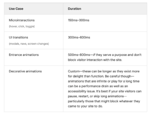
(fast = snappy, slow = calm, easing = personality) - Most motion on the web should be kept short and snappy
(when in doubt, speed it up)
6. Project 2: Event Website
due 4.29 @midnight
Project 2 Timeline:
w4.22 hp/sp mockup critique feedback;
m4.27 blog 4: development plan + warmup 6
w. 4.29 10–15 digital iterations / versions social media
t5.5@midnight Final Project Due Date
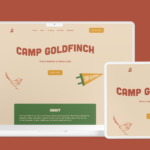
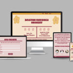
This week, we are continuing P2 with the finalizing of our homepage and subpage mockups. You have the choice if you wish to use DW or Webflow to develop your final project. We will end the week beginning our site development
8. Blog #4: Project 2 Development Plans
Blog 4 is your development blueprint. This post bridges your design and your build. You will translate your visual layout into a structural plan that could realistically be built in Webflow. We are thinking like developers.
- Introduction (1 Points): Briefly introduce (1) your event theme, (2) your storytelling goal, (3), the intended user experience, and (4) the emotional tone you are aiming to create. Keep this concise (1-2 short paragraphs).
- Structural Layout Mapping (5 Points) This will serve as a visual development map.
Desktop-Only Screenshot + Structural Overlay: Upload one annotated screenshot of your desktop prototype. On top of the image, clearly label:
A. Page Structure:body,nav,header,footer,sections(minimum of 5 sections) Keep in mind:
body: The overall container for your website.
header/footer: Top and bottom sections that likely contain your navigation and copyright information.
sections: Major content areas within your body, potentially corresponding to Webflow sections.
containers: For managing content width, corresponding to Webflow’s container element (live inside sections).
divs: Used for grouping content or layout purposes, translating to div blocks in Webflow.
B. Layout System Inside Each Section: Show how each section is built using: Section → Container → QuickStack → Columns → Nested Elements (h1, h2, ul, p, div, etc). Indicate (1) the number of columns and (2) full-width vs. constrained containers and (3) whether columns are equal (50/50) or uneven (70/30). (4) Key next elements (h1, p, image, button, etc.) This is grid logic, considering how content is divided horizontally.
C. Breakpoint Notes: Below the image, include a short bullet list explaining how layout shifts at tablet and mobile.Below your image, include a short bullet list explaining: (1) what stacks on tablet and mobile, (2) how column structures change, (3) any nav shifts (menu → hamburger), (4) major layout adjustments)
- Development Strategy (4 Points) In one short paragraph, explain: (1) How you will construct your layout using QuickStack, (2) Where nesting may be required, (3) How will you manage spacing (margin vs padding), and (4) Any anticipated layout challenges. Focus on the structure, not the visual styling.
- To Submit, post to D2L Discussion Board > Blog 4
9. P2 Points to Consider:
- Make your headings stand out from your paragraphs. Also, consider making them a different color. Create a typographic hierarchy.
- Remember to cite all content retrieved from another source. Use links @ the bottom of each page or somewhere on site.
- Set up a unique title tag for each page.
- Did you optimize all of your images (appropriate file size, format, and image quality)?
- Style your hyperlinks on your pages. Get rid of the underline with a text-decoration: none; and try a border-bottom instead.
- Use proper file for images (NO SPACES; DESCRIPTIVE).
- Images: When to insert images through an HTML image tag <img> or through a CSS background image? Rule-of-thumb: If your images displays content in any way, place it in as an <img> in the content. If it is decorative or doesn’t make up the content, it can be a background image. Never include large blocks of text in any image. Also, break up multiple series of images into different images. By inserting images using the <img> tag, you can insert a descriptive ALT tag, to describe the content of your image.
- Create a unique title tag for each page. Include your name & page name “Cass Reese | About “
- Create a unique alt tag for each html <img>.
- Link logo to the homepage.
- Do not turn in any native files (.psd, .ai, etc).
- Unzip your folder before uploading.
- Did you finalize your 2–3 page presentation mockups and export as PDF?
- Did you fully complete your self evaluation?
10. 11. 13. Social Media Kit Guidance
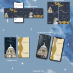
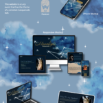
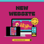
Refer back to our Project 2 sheet. Design 5 promotional assets to extend your event brand across platforms using Photoshop, Illustrator, or Adobe XD. Start with layout sketches and move into polished mockups.
Pick any 5:
- IG Post (1080×1080)
- IG Story (1080×1920)
- FB Event Banner (1200×628)
- Twitter/X Promo (1200×675)
Design Best Practices
- Keep it simple: Focus on one message per post.
- Use hierarchy: Make your headline pop using size, weight, or color.
- Stick to your brand: Use consistent fonts, colors, logos, and tone from your website.
- Design for small screens: Avoid tiny text—view at 100% often!
- Use guides or grids for alignment
- Use whitespace: Don’t overcrowd—leave breathing room.
- Add a CTA: “Tap for more,” “Save the date,” or a URL (use eventsite.com, not long links).
- Check contrast & legibility: Especially over photos—use overlays or type boxes if needed.
- Keep file dimensions accurate
- Save in .JPG or .PNG for submission
Sketch to Final Example Process:
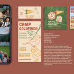
- Social Media Kit Process work – Steph Toto
- Dribbble Social Media Kits
- Adobe Express – Social Templates
- Instagram Grid Tips from Later.com
- Behance – Social Media Kit Projects
- Alana Wright – Process Work
Software Tips
- Use Artboards in Photoshop or Illustrator to set up all 5 assets in one file.
- Use XD Repeat Grid to quickly mock up carousel or story sets.
- Export at correct pixel sizes (JPG or PNG).