📌 Weekly Structure (applies every week)
- Final Exam Schedule for PennWest
- Content Release: Mondays @ 11 AM(Tues @ 11 AM if holiday week).
- Deadlines: All assignments due Mon @ noon (or Tue when no Monday class)
- ZOOM : Optional. Monday review + critique (recorded). If no Monday class → prerecorded review + Wed @ noon live session.
- Critiques:
- Regular weeks: Mon @ noon → Wed @ noon
- No Monday class: Tue @ noon → Thu @ noon
- Use discussion board if not in ZOOM
- Remote Office Hours: Wednesdays, 11AM–1PM → Schedule Here
Week 15 Links & Notes
Live Sessions This Week:
👉 Join Live: Mon 4.27 @ noon(week 15 review)→ 🎥 [Join Here]
Will be recorded for those unable to attend live.
🎥 Watch: Mon 4.27 Weekly Review Recording → [Watch Here]
Looking Ahead (Week 16) – Finals Week
Finals week (last) live session: Mon May 4th @ noon
Final Exam Schedule for PennWest
This Week’s deadlines
Next Tuesday, May 5th @ midnight
Final P2 Submission – What to Submit:
Publish your final Webflow site. Upload your published website link to D2L Project 2 assignments folder.
- P2 Presentation Mockup
– Upload your final presentation mockup 2-3 pages. Consider including your social media kit on a separate page mockup.
–Important: Instead of 3 separate folders, I will create ONE folder for everything above (P2 Final Submission: Link, Mockup PDF, Social Kit, Self-Eval)
– Upload everything at once by the deadline—this includes your website, mockup, video, and social media kit, process work.
– Missing pieces will result in points deducted.
– Project 2, if late, will not be accepted past Thursday 5.7 at midnight (2 days late). - P2 Social Media Kit
– Upload your 5 finalized social media promotional assets.
– Include all file types (JPG or PNG) in a clearly labeled folder. - P2 Self-Evaluation
– Ensure all of your process work is on Medium in one story. - P1 + P2 Presentation Video: I will create a new D2L folder for your presentation videos for P1 + P2. Upload your final presentation video (keep under 1 minute). Since we lost points with cancelling Exercise part 3, I will make this for 5 points to lift your grade. Full points for completion (2.5pts each). I cover how to create the videos in this week’s video recording.
Project 1 Revision Opportunity (optional)
Revision Deadline: Monday, May 4th @midnight – extended, remember to include your reflection
- IF you decide to resubmit for up to 6 bonus points, I’ve opened up another folder on D2L “P1 Revision Opportunity for Bonus Points” (details under week 12)
Late work reminder:
– Final late work submission cutoff: No work will be accepted after Fri, May 1 @ 11:59 PM (this Friday).
– Any late assignment (excluding Project 2) submitted on May 2nd or later will receive an automatic zero (0).
Weekly Content
Week 15
SECTION I – Favicons + Final Presentations
- Discuss Favicons (in weekly recording)
- Review Footer Tips
- Review Components Guidance
- Review Favicon Resources
- Review Presentation Mockups Requirement
SECTION II – Project 2 - Due next Tues@midnight. Finalize and Submit P2: Event Website
- Due next Tues@midnight. Complete The Final Blog
- Due next Tues@midnight P2 Mockups JPEGS to Medium “P2 Story” + Upload PDF to “P2 Presentations Mockups + P2 Self Eval” on D2L – View Mockup Guide
- Due next Tues@midnight P2 Self-Eval – Upload PDF to “P2 Self Eval” on D2L
- Due next Tues@midnight P1 + P2 Videos (under 1 minute) on D2L to “P1 + P2 Presentation Videos”
SECTION 1 – FAVICONS + Final Pres.
1. Favicons
We discuss favicons in our weekly review above.
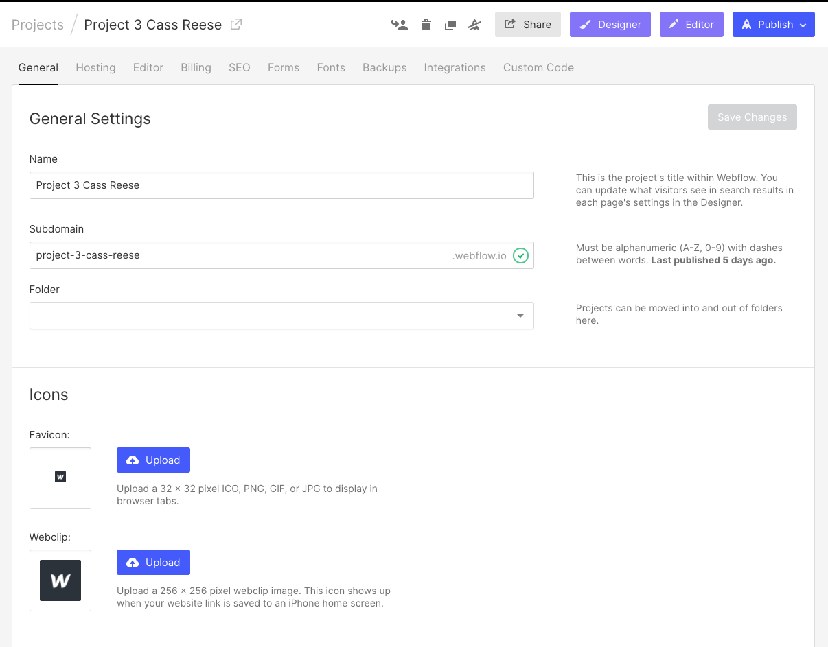
- For P2, we will be creating one size favicon: 32px x 32px
- File formats: .png
- “Save for Web & Devices” 32px PNG file (make sure transparency is checked).
- In Webflow: upload through the Settings > General tab in Webflow.
4. Favicon Resources:
- Read Create a favicon for your site in 8 steps & create your own favicon
- Favicon Gallery
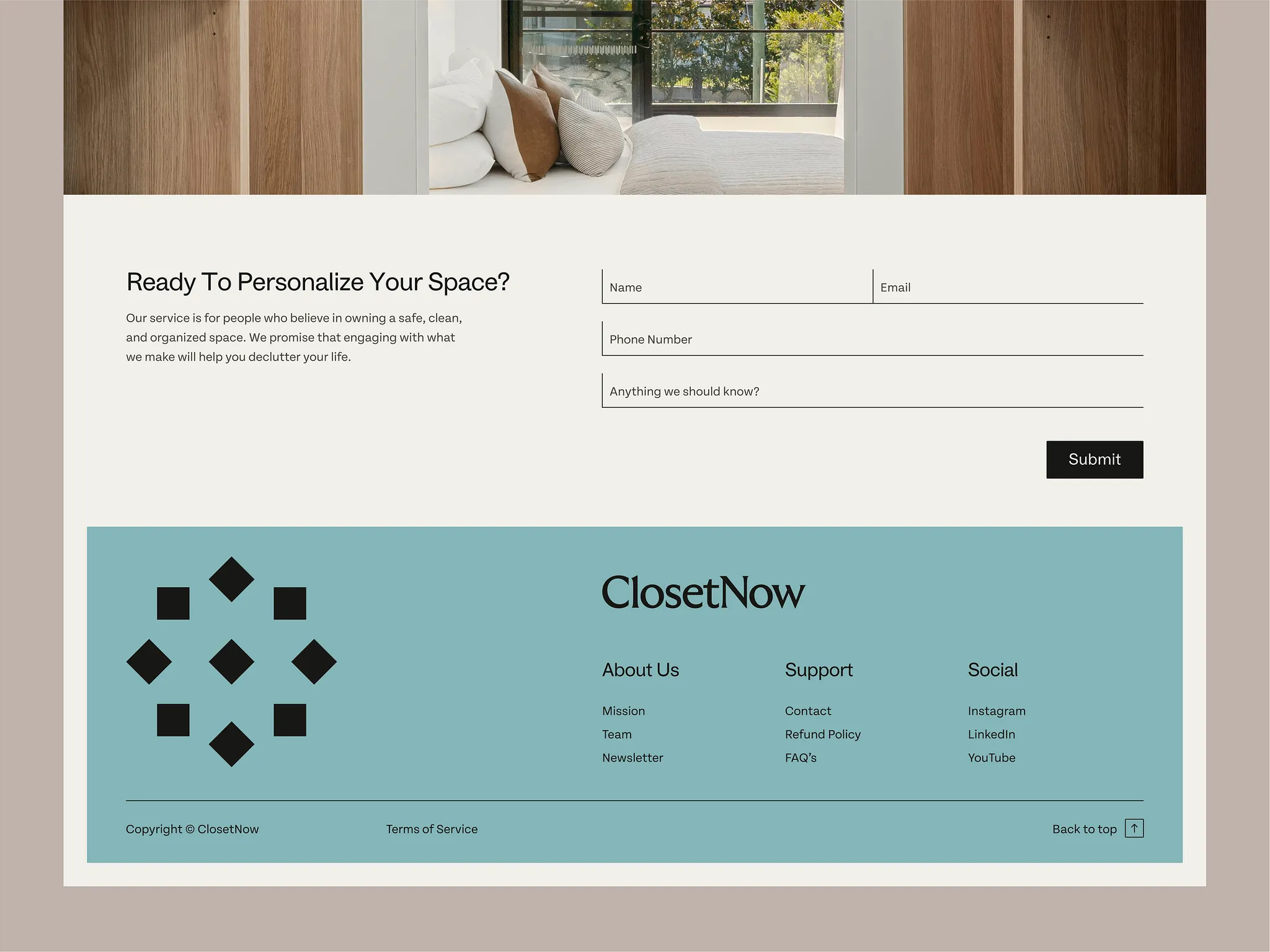
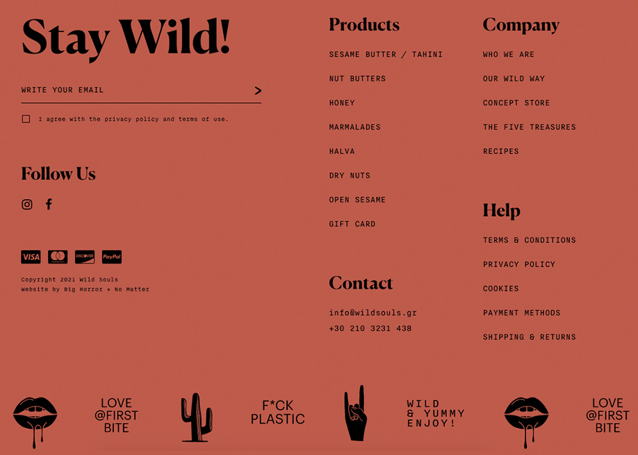
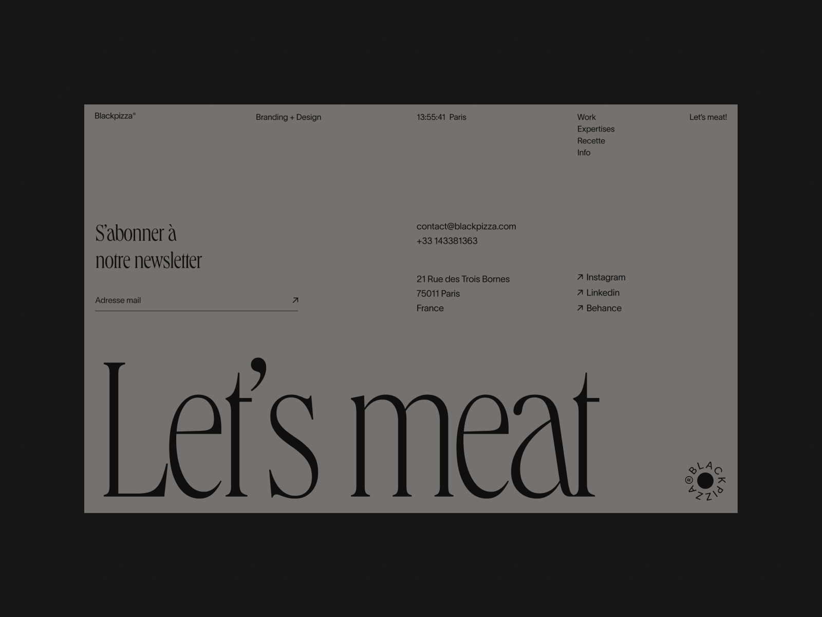
2. Footer Tips
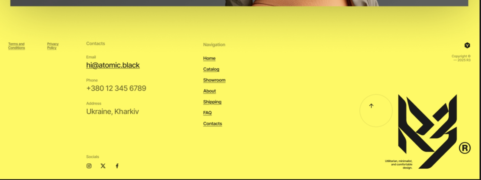
If a user scrolls all the way down and still isn’t sure what to do… does your footer help them or leave them stuck?
- Treat the footer as a second navigation system
- include key links + contact info
- Use clear column structure (not random placement)
- Prioritize hierarchy with typography
- Use h4/h5 for headings, smaller body text for links
- Use contrast to separate the footer
- Keep spacing intentional
- Don’t overload it (if everything is important, nothing is)
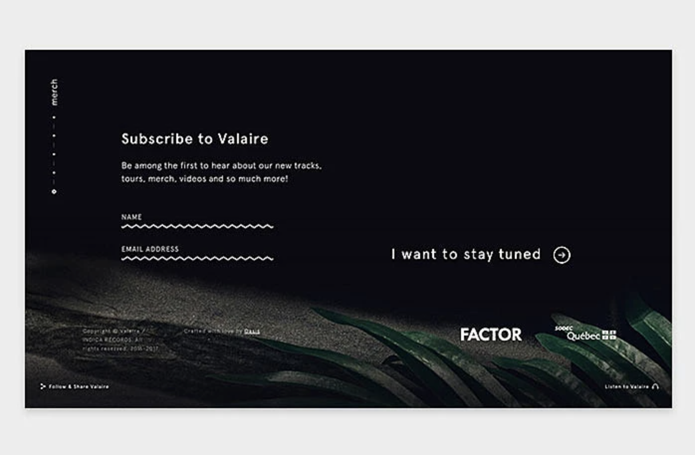
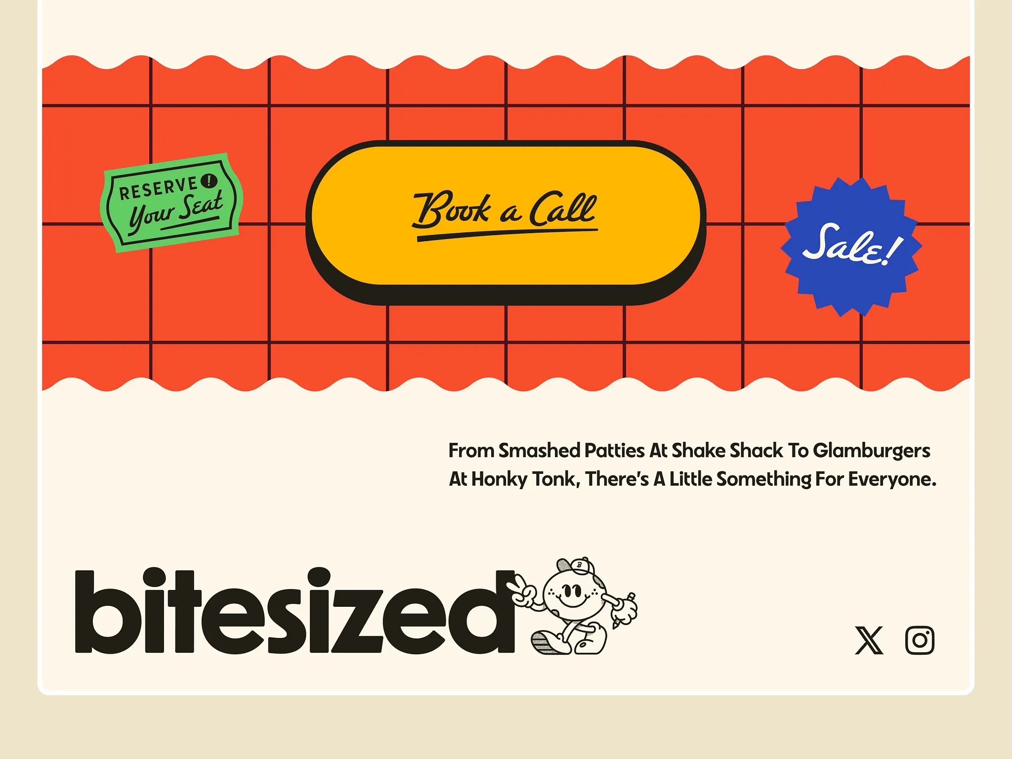
- Add personality
- Footers are a great place to reinforce tone: illustrations, subtle animations, brand voice
- Include utility elements user expect
- copyright, social links, back-to-top buttons, contact info
3. Components Guide
When deciding how to structure content, ask yourself—what problem am I solving for the user?
Pick components because they solve a user problem.
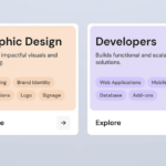
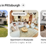
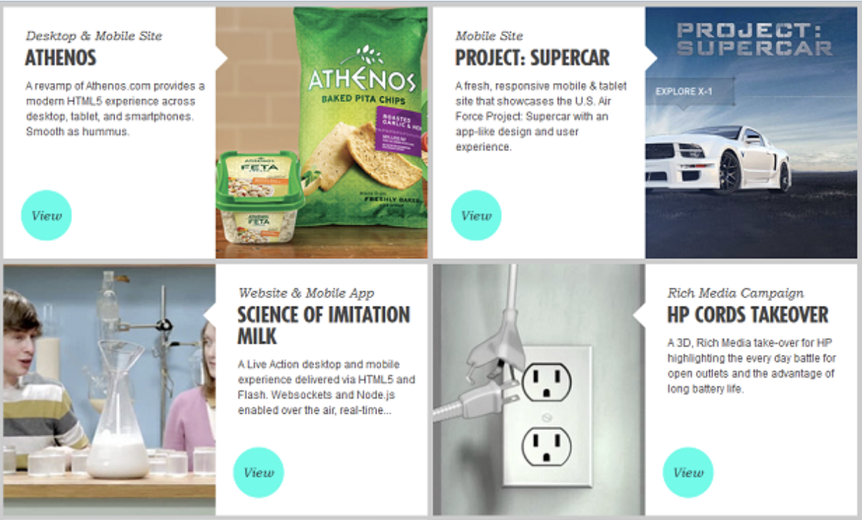
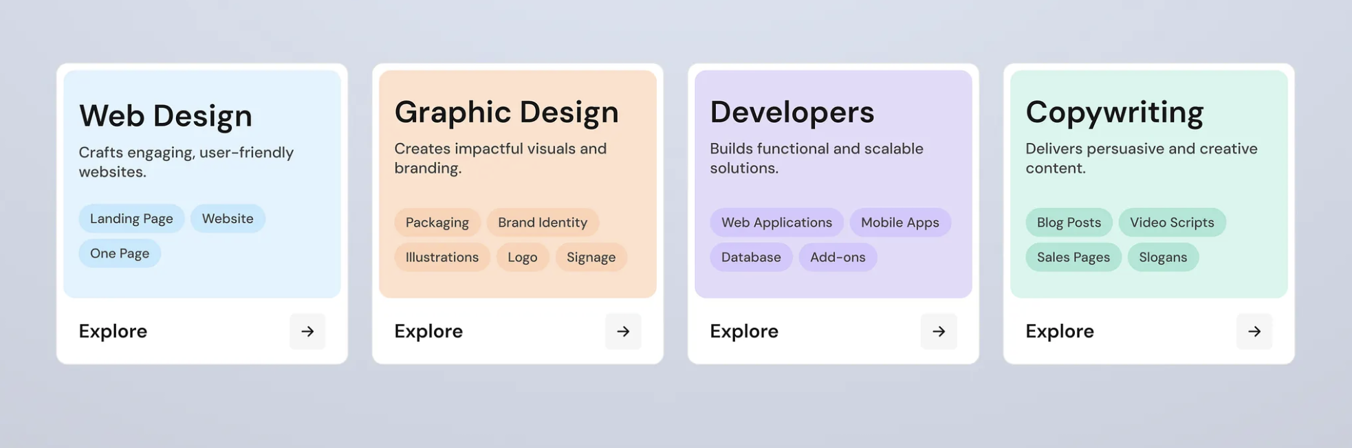
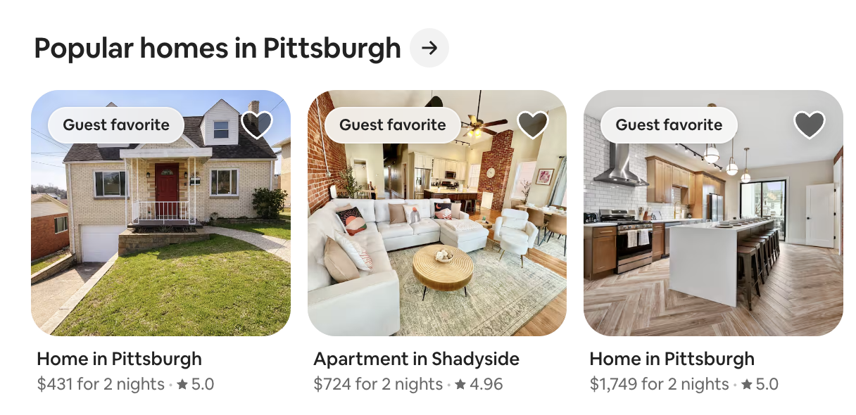
- Cards (most overused + most useful) – if content repeats
- use when: you have repeatable content, users need to scan quickly, each item has equal importance
- examples: events, team members, blog posts, products
- best for: browsing, comparison, visual grouping
- avoid when: content is long or sequential, items aren’t equal
- resource: Play your Cards Right

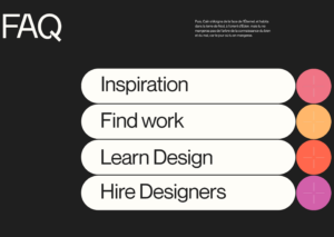
- Accordions (collapse / expand) – if it’s optional or detailed
- use when: you have a lot of text, only some users need details, you want to reduce scrolling
- examples: FAQs, schedules, rules / requirements
- best for: hiding complexity, progressive disclosure
- avoid when: content is critical, users need to compare items side-by-side
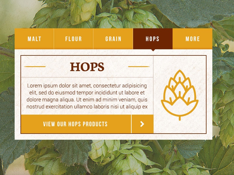
kffein – Dribbble
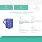
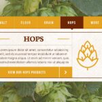
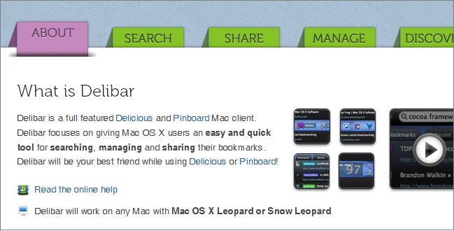
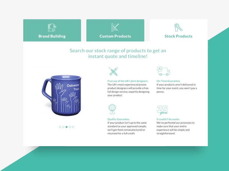
- Tabs (switch between content) – content belongs together, but not at same time
- use when: you have related content groups, users need to compare categories
- examples: pricing tiers, event schedules, program tracks
- best for: switching content, saving space
- avoid when: users might miss hidden content, content order matters
- Sections (the foundation) – new ideas = new sections
- use when: content is different in purpose, you need clear hierarchy
- examples: hero, about, schedule, registration
- best for: storytelling, flow, structure
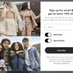
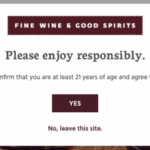
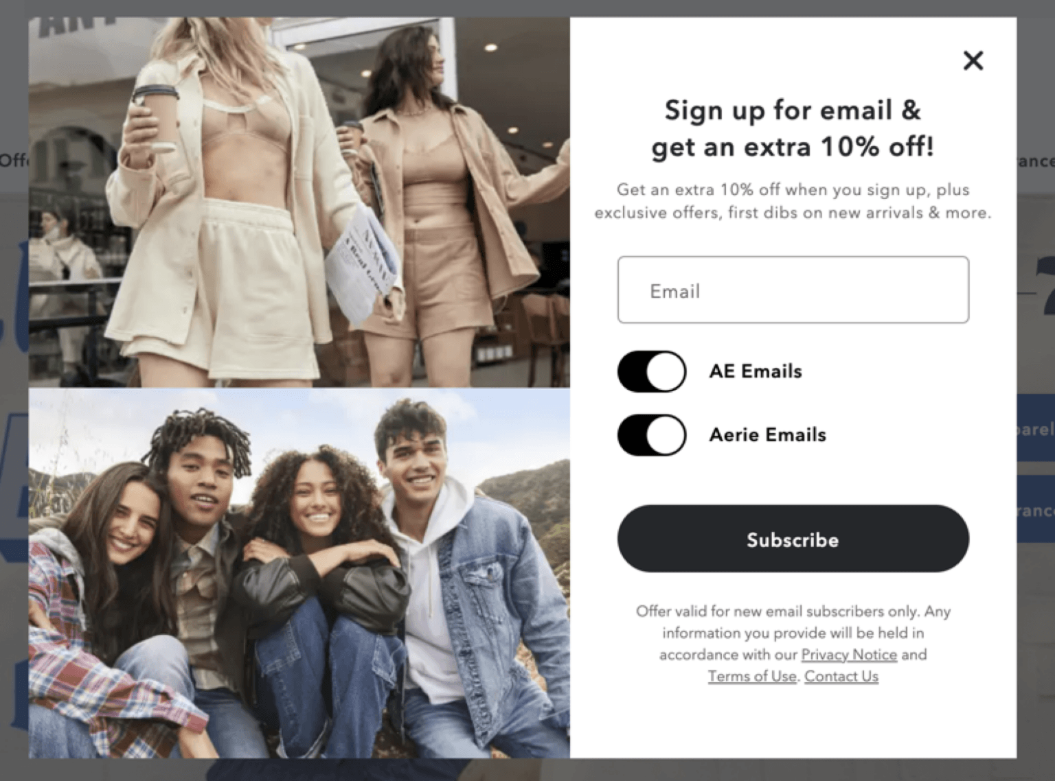
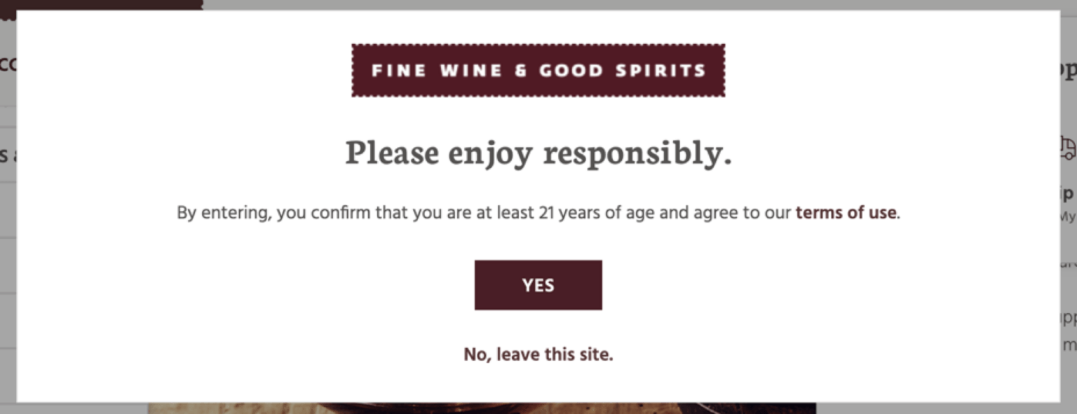
- Modals (pop-ups) – for action, not content
- use when: you want focused interactions, users shouldn’t leave page
- examples: sign up, quick info, previews
- avoid when: too frequent, annoying, essential content
- Forms (interaction)
- user when: collecting info, registration, contact
- best practices: keep short, group fields, clear labels
- Lists
- use when: steps, rules, features
- why: easier to scan, clearer than paragraphs

| Goal | Component |
|---|---|
| Browse | Cards |
| Hide details | Accordion |
| Compare categories | Tabs |
| Tell a story | Sections |
| Take action | Button / Form |
| Show quick info | Modal |
5. and 8. Presentation Mockups
Mockups Please prepare a PDF of 2–3 pages, formatted for 11″x17″, which can be presented in either portrait or landscape orientation. These mockups will not only be displayed in the hall but can also be scaled down (later) to 1920×1080 pixels for your Flux Submissions in the Fall, ensuring a seamless transition from print to digital. Each mockup should include (reference Download: MOCKUP FILES for folios and inspiration):
- your full name
- Project 2: Event Website
- Assistant Professor: Cass Reese
- Course: Web Design
- Term: Spring 20##
- To provide context, integrate a brief, descriptive sentence about your concept within the design. (Reference our last blog)
- Screenshot all work on the server in its developed form before creating mockups. As an alternative to taking a screenshot of your live website, you may want to install a screen capture plugin on your browser.
You should upload JPEG to your Medium for viewing & PDF to D2L for downloading.
6. Project 2: Event Website
due next Tues @midnight (D2L)
This week, we will focus on P2 development.
9. P2 Self Evaluation (edited to add 6 questions)
10. P1 + P2 Presentation Videos: Creating a Scrolling Website Preview in After Effects
5pts (2.5pts each) – video below exported from this week’s live recording
You will create a short, polished video for project that simulates scrolling through your website. Rather than recording your screen, you’ll use motion design techniques to control pacing and create a smoother, more intentional experience.
You will import your full-page website screenshot (use this plugin) into After Effects and animate its vertical position over time. This allows you to guide the viewer through your design in a way that feels fluid and deliberate.
What you’ll do:
- Create a vertical composition (1080 × 1920)
- Import your full-page screenshot
- Animate the Position of the image from top to bottom using keyframes
- Apply Easy Ease (F9) to smooth the motion
- Adjust timing so each section of your site is visible for ~2–3 seconds
- Think of your animation like a guided scroll.
We should have enough time to read or understand each section before moving on.- Hero / intro → can sit a little longer (2.5–3s)
- Include a slight pause at the beginning and end for a more natural flow
- Dense content sections → also longer
- Simple transitions / dividers → shorter (1.5–2s)
- Hero / intro → can sit a little longer (2.5–3s)
- Think of your animation like a guided scroll.
Goal:
Your final video should feel smooth and intentional, not like someone manually scrolling. Think of this as presenting your website, not just showing it.
Optional refinement (demonstrated in live session):
We will briefly look at the Graph Editor to shape motion curves and create a more natural acceleration and deceleration.
Exporting Your Video
Once your animation is complete, you will export your video directly from After Effects.
Steps:
- Go to File → Export → Add to Render Queue
- In the Render Queue:
- Click Output Module (usually says “Lossless”)
- Change Format to H.264 (render as QuickTime (Lossless) 720p or 1080p if this is missing)
- Click Output To and choose where to save your file
- Click Render
Your video will export as an MP4, ready for upload to D2L.