Due Today: Homepage/Subpage revisions to Medium + S26_Project2_DesignProcess / 15 social media digital ideation to Medium
For Today: Interactions + Warmup 6 / Homepage Revisions + Subpage Mockups (phone, tablet, desktop) small groups – S26_Project2_DesignProcess
- Discuss Webflow Animation/Interactions
- Begin Warmup 6
- Review Interactions Resources
Interactions
This week, we will continue with learning Interactions in Webflow and move into our final warmup 6.
Interactions Resources
- Webflow Interactions 1
- Webflow Interactions 2
- Show/hide navigation on scroll
- Reveal elements on scroll
- Reveal elements on hover
- Show and hide on click
- Parallax movement on scroll
- Interactive Guide Reveals UI/UX Animation Principles
- Animate button’s border on hover
Warmup 6 – Motion Foundations
due Tuesday 4.28 @11:15AM
Before you begin: Webflow recently updated how interactions work. You’ll notice the interface… and more importantly, the logic… looks different than older tutorials. The new system is built on GSAP (GreenSock Animation Platform), a professional animation engine used in web design. While this required updating course content, the upside is important:
This new model more closely reflects how motion is created in tools like After Effects… focusing on timing, sequence, and intention.
How to think about motion (important shift)
Previously, interactions worked like this:
“When this happens → do this animation”
(logic-based, like flipping a switch)
Now, interactions work like this:
“When this happens → animate these elements over time”
(time-based, like directing a short scene)
Core interaction process
All interactions now follow this structure:
trigger → target → action → timeline
- trigger = what starts the motion
- target = what moves
- action = what changes (opacity, position, blur, etc.)
- timeline = how it unfolds over time
To Begin:
Create a new Webflow site and:
- Create 4 separate sections for each interaction below
- Add 4 containers (1 per section)
- Add a simple QuickStack – 3 columns – image grid (3 images)
- Interaction #1 – Hover Fade: (1 pt) Create a hover interaction where all three images blur on hover and return to sharp on hover out.
- Trigger: hover
- Target: image group
- Action: Fade (opacity)
- Timeline:
- Hover in → opacity (to 50)
- Hover out → opacity (to 100)
- Teaching focus: This introduces the idea of two states over time (hover in vs hover out). Pay attention to how quickly the blur happens… timing affects how the interaction feels.
- Interaction #2 – Scroll into View: (1 pt) Animate the images so they fade in and move upward as they enter the viewport.
- Trigger: element scroll into view
- Target: images
- Timeline:
- opacity 0 → 100
- y position: 40px → 0
- Teaching focus: This is one of the most common patterns in web design. Notice how combining opacity + movement helps guide attention and create hierarchy.
- Parallax: (.5 pt) Create a simple parallax effect
- Set a background image to fixed.
- Trigger: while scrolling
- Animate:
- background position OR element Y movement
- Teaching focus: Parallax introduces the idea of continuous motion instead of a one-time event. Subtlety is key. Small movement often feels more refined than large movement.
- background position OR element Y movement
- Create your own interaction (2.5 pts) Create your own interaction using your content (images, buttons, typography, etc.). You can use this as an opportunity to experiment with something you would like to try with your own website. Use motion intentionally, not just for decoration.
Think about:- What are you drawing attention to?
- What happens first vs second?
- How does timing affect the experience?
- Publish your link and submit to D2L via “Warmup 6” Submission Folder.
High-Level Motion Design Tips
- Motion should guide the eye, not decorate
(if everything moves, nothing matters) - Start simple: opacity + position is enough
(most good web motion is just this) - Timing matters more than complexity
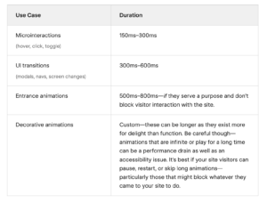
(fast = snappy, slow = calm, easing = personality) - Most motion on the web should be kept short and snappy
(when in doubt, speed it up)
Blog #4: Project 2 Development Plans
Blog 4 is your development blueprint. This post bridges your design and your build. You will translate your visual layout into a structural plan that could realistically be built in Webflow. We are thinking like developers.
- Introduction (1 Points): Briefly introduce (1) your event theme, (2) your storytelling goal, (3), the intended user experience, and (4) the emotional tone you are aiming to create. Keep this concise (1-2 short paragraphs).
- Structural Layout Mapping (5 Points) This will serve as a visual development map.
Desktop-Only Screenshot + Structural Overlay: Upload one annotated screenshot of your desktop prototype. On top of the image, clearly label:
A. Page Structure:body,nav,header,footer,sections(minimum of 5 sections) Keep in mind:
body: The overall container for your website.
header/footer: Top and bottom sections that likely contain your navigation and copyright information.
sections: Major content areas within your body, potentially corresponding to Webflow sections.
containers: For managing content width, corresponding to Webflow’s container element (live inside sections).
divs: Used for grouping content or layout purposes, translating to div blocks in Webflow.
B. Layout System Inside Each Section: Show how each section is built using: Section → Container → QuickStack → Columns → Nested Elements (h1, h2, ul, p, div, etc). Indicate (1) the number of columns and (2) full-width vs. constrained containers and (3) whether columns are equal (50/50) or uneven (70/30). (4) Key next elements (h1, p, image, button, etc.) This is grid logic, considering how content is divided horizontally.
C. Breakpoint Notes: Below the image, include a short bullet list explaining how layout shifts at tablet and mobile.Below your image, include a short bullet list explaining: (1) what stacks on tablet and mobile, (2) how column structures change, (3) any nav shifts (menu → hamburger), (4) major layout adjustments)
- Development Strategy (4 Points) In one short paragraph, explain: (1) How you will construct your layout using QuickStack, (2) Where nesting may be required, (3) How will you manage spacing (margin vs padding), and (4) Any anticipated layout challenges. Focus on the structure, not the visual styling.
Share the blog on D2L Discussion > Blog 4
Project 2 Timeline
- tr4.23 development plan + wireframes
- Finals Week w 5.6@midnight Final Project Due Date
Due Next Class:
- Blog 4 – Development Plans
Due Next Tuesday:
- Social Media – 10-15 digital variations
- Warmup 6 – submit published link to D2L Assignments Folder