Due Today: Blog 4 to D2L
For Today: Discuss Footers, Discuss Components, Forms mini-Demo w/ easing discussion, Small Groups: Social Media; P2 Dev Studio
Forms, Domains, and Hosting
Hosting & Forms Resources:
- Hosting
- Hosting Services
- Hosting Services
- DNS | SmashingMagazine.com
- Top Ten Hosting Reviews
- Forms
- Form Text Labels | Tryit Editor
- CSS Form Designs
- Form Designs on Codepen
- Forms | Duckett’s HTML&CSS Book
- Button Animation
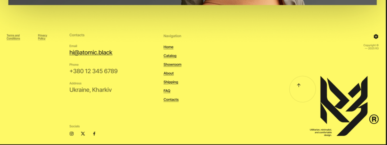
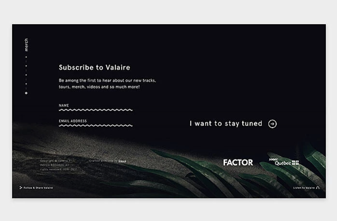
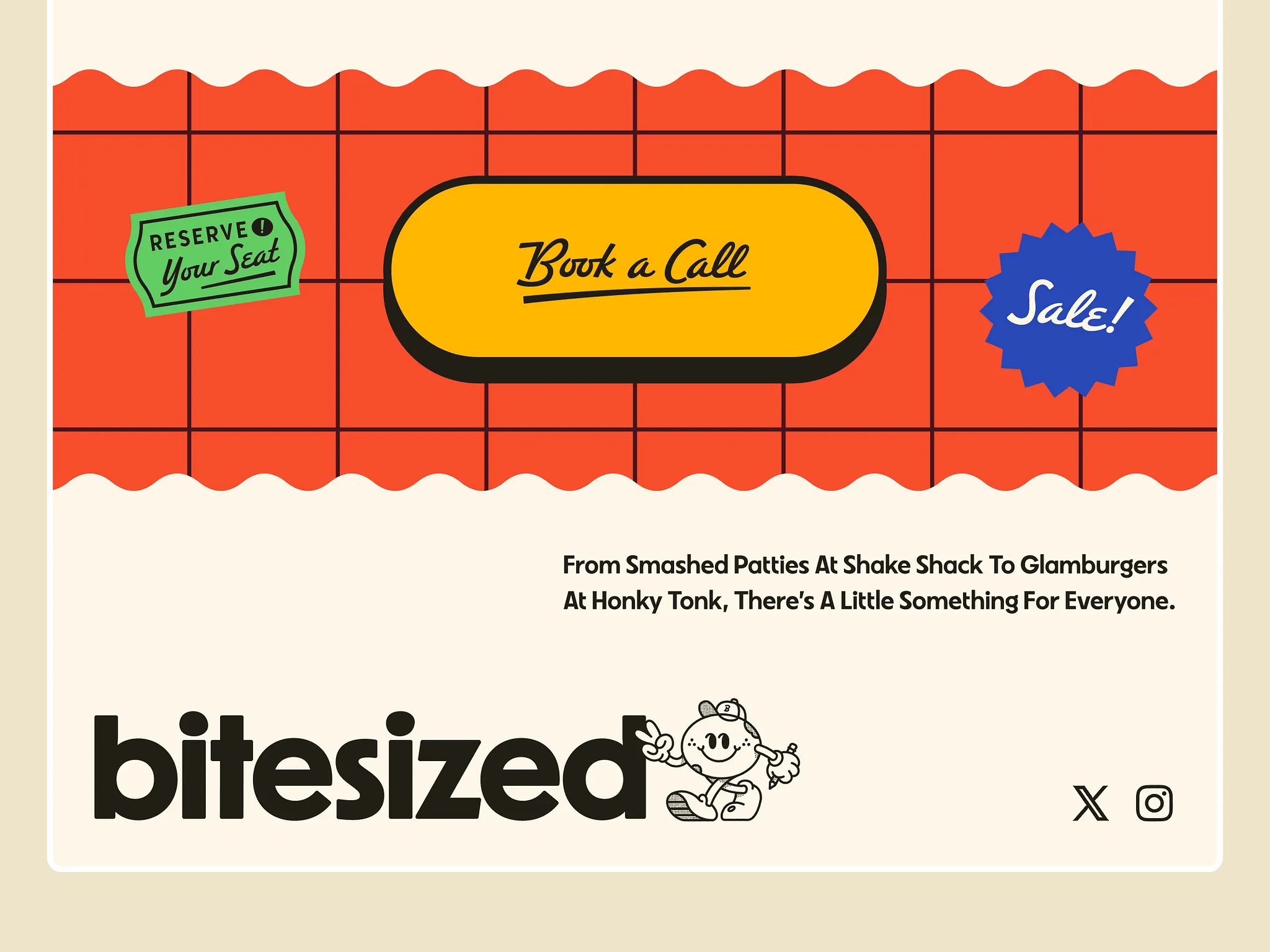
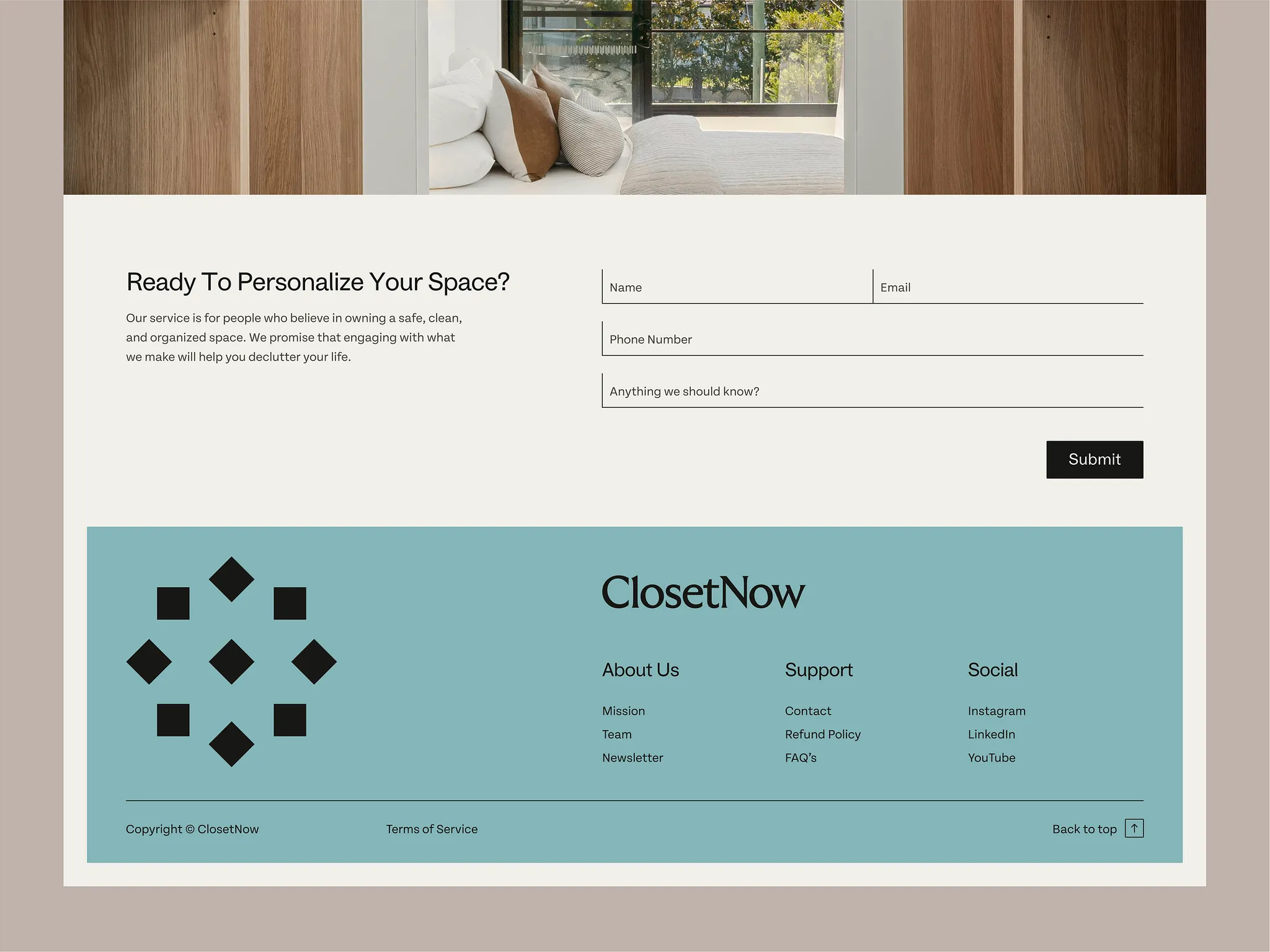
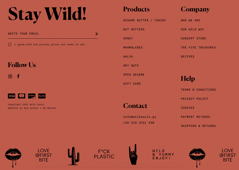
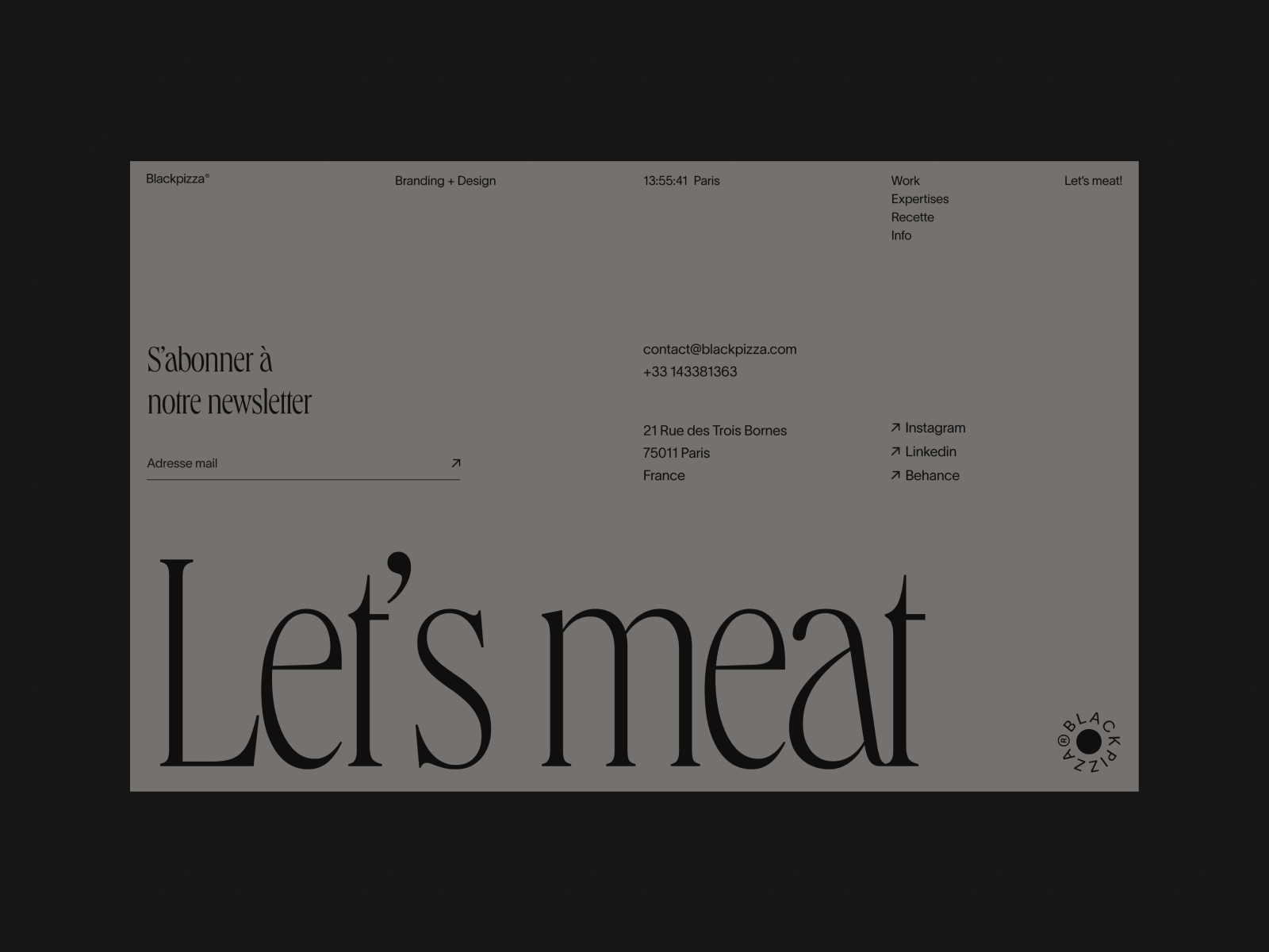
Footer Tips
If a user scrolls all the way down and still isn’t sure what to do… does your footer help them or leave them stuck?
- Treat the footer as a second navigation system
- include key links + contact info
- Use clear column structure (not random placement)
- Prioritize hierarchy with typography
- Use h4/h5 for headings, smaller body text for links
- Use contrast to separate the footer
- Keep spacing intentional
- Don’t overload it (if everything is important, nothing is)
- Add personality
- Footers are a great place to reinforce tone: illustrations, subtle animations, brand voice
- Include utility elements user expect
- copyright, social links, back-to-top buttons, contact info
Components Guide
When deciding how to structure content, ask yourself—what problem am I solving for the user?
Pick components because they solve a user problem.
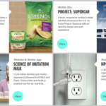
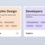
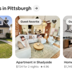
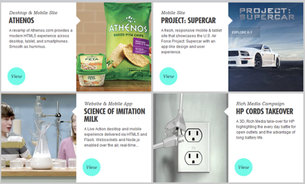
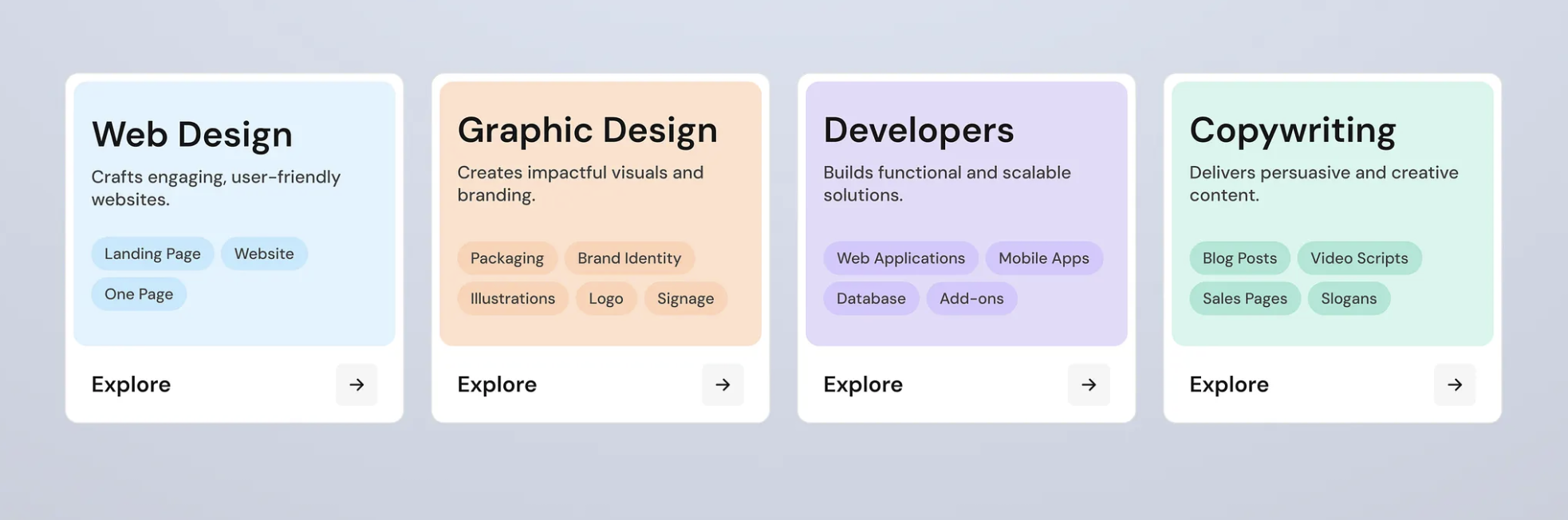
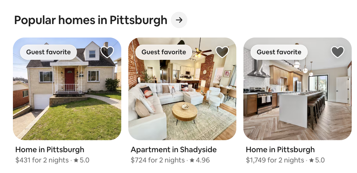
- Cards (most overused + most useful) – if content repeats
- use when: you have repeatable content, users need to scan quickly, each item has equal importance
- examples: events, team members, blog posts, products
- best for: browsing, comparison, visual grouping
- avoid when: content is long or sequential, items aren’t equal
- resource: Play your Cards Right

- Accordions (collapse / expand) – if it’s optional or detailed
- use when: you have a lot of text, only some users need details, you want to reduce scrolling
- examples: FAQs, schedules, rules / requirements
- best for: hiding complexity, progressive disclosure
- avoid when: content is critical, users need to compare items side-by-side
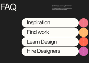
kffein – Dribbble
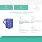
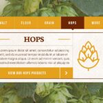
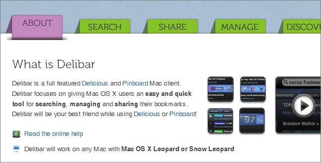
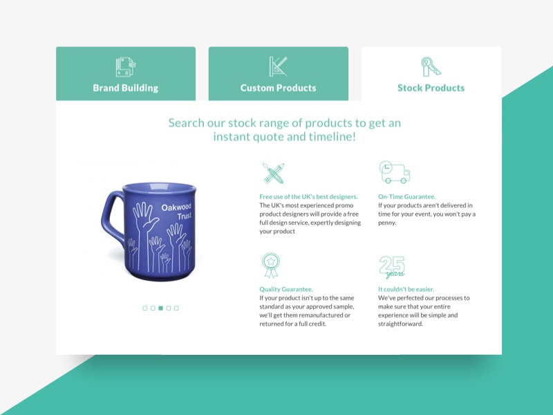
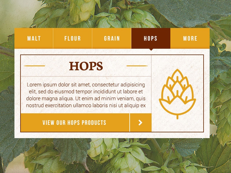
- Tabs (switch between content) – content belongs together, but not at same time
- use when: you have related content groups, users need to compare categories
- examples: pricing tiers, event schedules, program tracks
- best for: switching content, saving space
- avoid when: users might miss hidden content, content order matters
- Sections (the foundation) – new ideas = new sections
- use when: content is different in purpose, you need clear hierarchy
- examples: hero, about, schedule, registration
- best for: storytelling, flow, structure
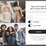
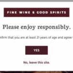
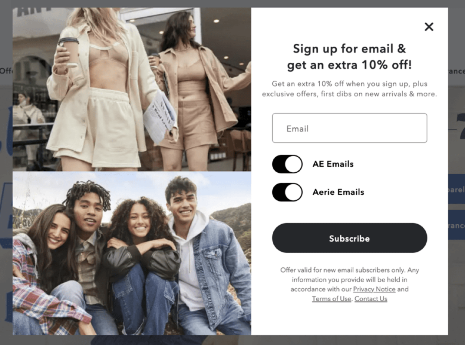
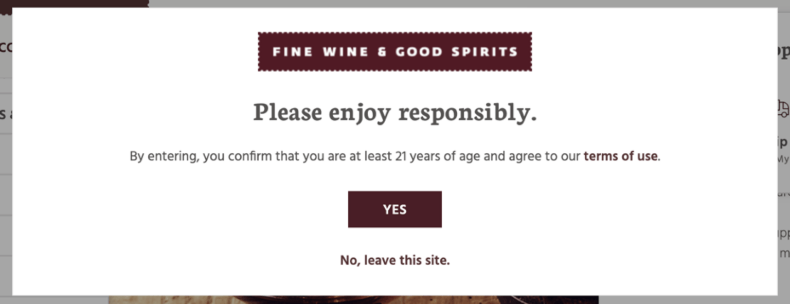
- Modals (pop-ups) – for action, not content
- use when: you want focused interactions, users shouldn’t leave page
- examples: sign up, quick info, previews
- avoid when: too frequent, annoying, essential content
- Forms (interaction)
- user when: collecting info, registration, contact
- best practices: keep short, group fields, clear labels
- Lists
- use when: steps, rules, features
- why: easier to scan, clearer than paragraphs

| Goal | Component |
|---|---|
| Browse | Cards |
| Hide details | Accordion |
| Compare categories | Tabs |
| Tell a story | Sections |
| Take action | Button / Form |
| Show quick info | Modal |
Project 2: Event Website
- tr4.23 development plan + wireframes
- Finals Week w 5.6@midnight Final Project Due Date
Due Start of Next Class:
- Begin development of Project 2 – you got this! 🙂
- 10–15 digital explorations of social media post
- Warmup 6 – submit published link to D2L Assignments Folder